


aprilia
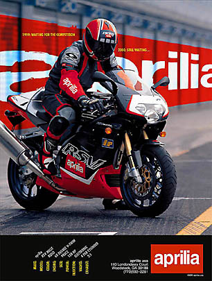
The client supplied original image lacked elements needed to communicate the logo and build identity.
An image map was created from the pit garages and the logo was enhanced to fit the perspective.
Other design elements included pumping up the pit road tire marks for contrast.
Multiple copies of the bike and rider were used to separate the bike from the background and allow the background logo to show through in areas like the windscreen.
The result was an ordinary press pic repurposed to convey tension, style, and brand identity.
Body copy was written to be read as tech detail callouts.
headline
1999: Waiting For the Competition
2000: Still Waiting
2000: Still Waiting
Making the Ordinary Extraordinary
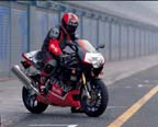 original
concept,
copy, imaging by john siebenthaler
for more on photo manipulation,
back to imaging